
The Role of Color Schemes in Home Renovations


Color scheme planning is defined as the deliberate selection and coordination of colors across all surfaces, materials, and finishes in a renovation to create a unified, functional living environment. The role of color scheme renovations goes well beyond picking a paint shade you like. A 2026 study of 454 urban residents found that cohesive interior color and light directly boost residents’ health and emotional attachment to their homes. That finding reframes color from a decorative decision into an architectural one. Get it right, and your renovation feels intentional and alive. Get it wrong, and even expensive finishes can feel disconnected and flat.
How do color schemes influence mood and well-being in renovated spaces?
Color is one of the most powerful environmental levers in any renovation. Environmental psychology research published in spring 2026 shows that low- to mid-saturation colors, such as muted greens and soft blues, improve cognitive restoration and reduce mental fatigue. High saturation, by contrast, can cause sensory overload, particularly in home offices where sustained focus is required.
The practical takeaway is that different rooms call for different emotional briefs:
Living rooms and family spaces benefit from warm neutrals and earthy tones that encourage relaxation and social connection.
Home offices and study areas perform best with muted greens, soft blues, or warm whites that support concentration without visual noise.
Bedrooms respond well to low-saturation, cool or neutral palettes that signal rest and reduce stimulation.
Kitchens and dining areas can handle slightly warmer, more energetic tones that encourage appetite and conversation.
Saturation and contrast both shape how a room feels. A high-contrast palette, think dark cabinetry against white walls, creates energy and definition. A low-contrast palette, such as layered warm taupes, produces calm and cohesion. The risk sits at the extremes. Too much contrast reads as chaotic. Too little reads as flat.
“Colour planning should account for ceiling height, light cycles, and room volume. Treating paint as a decorative afterthought ignores the architectural reality that colour changes how a space is perceived and experienced.” — James Treble, interior design expert
This is why renovation color psychology is not a soft skill. It is a structural consideration that shapes how your home actually feels to live in, day after day.
What are the key principles for effective color scheme design?
Good color scheme design follows a small set of rules that experienced designers apply consistently. Understanding these rules gives you a framework for making confident decisions rather than guessing.
Manage contrast deliberately. Contrast is a primary design lever: high contrast energizes a space, low contrast calms it, and a complete absence of contrast creates visual unrest. Every room needs a conscious contrast decision, not an accidental one.
Control saturation by room function. Highly saturated colors work well as accents or feature walls in social spaces. They overwhelm in rooms where you need to focus or rest. Match saturation level to the emotional purpose of the room.
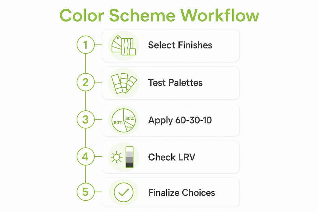
Apply the 60-30-10 rule. This classic design ratio allocates 60% of a room’s color to the dominant tone, typically walls and large surfaces. The secondary color takes 30%, covering upholstery, rugs, or cabinetry. The accent color fills the remaining 10% through cushions, artwork, or hardware. This ratio creates balance without monotony.
Place strong colors with intention. Keeping bold colors below or above eye level controls mood and prevents a room from feeling oppressive. A deep navy on a lower wall or a rich terracotta on a ceiling reads as grounded and deliberate. The same color at full wall height can feel suffocating.
Build a palette before you buy anything. Selecting colors in isolation, one wall at a time, is how renovations end up looking disjointed. A palette is a system, not a collection of individual choices.
Pro Tip: Test your palette as a physical board before committing. Pin paint swatches, fabric samples, and tile chips together and view them in the actual room at different times of day. Colors shift dramatically between morning light and evening artificial light.
The 60-30-10 rule and contrast management are not rigid formulas. They are guardrails that prevent the most common color mistakes. Once you understand them, you can break them intentionally and with confidence.

How to integrate color schemes with materials and architectural elements
Color does not exist in isolation. Every renovation includes fixed elements, flooring, tiles, benchtops, cabinetry, and hardware, that carry their own tones and undertones. The most effective approach is to start palette development with fixed materials and build outward from there. Choosing paint after fixed finishes produces far better harmony and far fewer costly corrections.
Why fixed finishes come first
Flooring and tiles are expensive and difficult to change. They set the undertone of the entire space. A warm-toned timber floor pulls every adjacent color toward warmth. A cool gray tile does the opposite. If you select paint before locking in these elements, you risk a mismatch that no amount of repainting will fully resolve.
Using Light Reflectance Value (LRV)
Light Reflectance Value, or LRV, is a scale from 0 to 100 that measures how much light a paint color reflects. A score near 100 reflects almost all light, making a space feel bright and open. A score near 0 absorbs light, creating depth and intimacy. LRV gives you an objective tool for predicting how a color will perform in a specific room before you apply it. North-facing rooms in Melbourne, which receive less direct sunlight, benefit from colors with an LRV above 60. South-facing rooms with strong afternoon light can handle lower LRV values without feeling dark.
The cost of uncoordinated selections
Tradespeople require early paint specifications for all finishes to price and schedule accurately. When color and material decisions arrive late or change mid-build, variations accumulate and timelines stretch. A complete color and material framework, finalized before purchasing begins, reduces miscommunication and keeps the project on track.
Pro Tip: Create a single reference board that shows every fixed finish alongside your paint selections. Share it with your builder and trades at the start of the project. This one document prevents the majority of color-related variations.
For homeowners planning extensions or new builds, Yorcon integrates this kind of color and material coordination into the design process from day one, which is one reason their projects tend to finish without the costly late-stage surprises that plague less structured renovations.
How to select and test renovation color schemes effectively
Choosing colors for home renovation is where many homeowners feel most uncertain. The good news is that a clear testing process removes most of the guesswork.
Sample in the actual room, not the store. Paint a large swatch, at least A3 size, directly onto the wall or onto a primed board. View it in the room where it will live, not under fluorescent store lighting.
Observe at multiple times of day. Morning light, midday sun, late afternoon, and evening artificial light all change how a color reads. A warm white that looks perfect at noon can turn yellow under incandescent lighting at night.
Account for room orientation. North-facing rooms in the Southern Hemisphere receive softer, cooler light. East-facing rooms get bright morning light that fades by afternoon. These conditions affect color perception significantly, and choosing colors based on room orientation is a standard professional practice in 2026 Australian residential design.
Use an anchor item to build your palette. A rug, a piece of artwork, or a fabric you love can serve as the emotional and tonal anchor for the entire room. Pull colors from it rather than starting from a blank page.
Consult a professional color consultant before committing. Professional color consultation prevents costly selection errors and saves homeowners significant time and money. A single session typically costs far less than repainting a room twice.
The best color palettes for homes are rarely the most dramatic ones. They are the ones that work consistently across lighting conditions, complement the fixed finishes, and support the way the room is actually used. For a broader look at what Melbourne homeowners are choosing right now, the 2026 renovation trends show a clear shift toward warm neutrals and layered earthy tones over the cool grays that dominated the previous decade.
Key Takeaways
Color scheme planning is a foundational architectural decision in any renovation, not a finishing touch, and integrating it early with fixed materials, LRV analysis, and professional input produces the most cohesive and cost-effective results.
Point | Details |
Color affects well-being | Cohesive color schemes physically boost health and emotional home attachment, per 2026 research. |
Match saturation to room function | Low- to mid-saturation tones support focus and rest; high saturation suits social accent areas only. |
Apply the 60-30-10 rule | Allocate 60% dominant, 30% secondary, and 10% accent color for balanced, intentional palettes. |
Start with fixed finishes | Select paint after flooring, tiles, and cabinetry are confirmed to avoid costly mismatches. |
Test before you commit | Sample large swatches in the actual room across multiple lighting conditions before finalizing any color. |
Color planning is architectural, not decorative
Here is the honest truth I have seen play out on renovation projects more times than I can count. Homeowners spend months making decisions about flooring, cabinetry, and fixtures, then treat paint color as a weekend errand. They grab a few swatches, pick one they like under the store lights, and wonder later why the room feels off.
Color is not decoration. It is architecture. It changes how large a room feels, how much light it holds, and how you feel standing in it at 7:00 AM on a Tuesday. When you treat it as an afterthought, you are making a structural decision by accident rather than by design.
The projects I have seen go smoothest are the ones where color and material planning happen before a single purchase is made. The palette becomes a reference document, not a mood board. Trades know exactly what they are working with. There are no late-stage surprises, no repaints, and no “we should have gone lighter” conversations after the furniture arrives.
My strongest advice is this: if you are planning a renovation, build your color and material framework in the first third of the design process. Use LRV to make objective decisions about light. Consult a color professional for at least one session. And if you want to maximize your space visually, color is one of the most powerful tools you have. Use it deliberately.
— Matthew
How Yorcon brings color and design together in Melbourne renovations
Getting color right in a renovation requires more than good taste. It requires a process that connects design decisions to construction realities from the very beginning.
At Yorcon, our home renovation services in Melbourne incorporate color and material coordination as a core part of the design workflow, not an add-on. We work with homeowners to develop a complete color and material framework before any purchasing or building begins. That framework travels through the entire project, keeping trades aligned and preventing the variations that inflate costs and delay completion. With nearly 20 years of experience across extensions, architectural builds, and heritage renovations, we understand how color interacts with light, volume, and the specific character of Melbourne homes. If you want a renovation that feels cohesive from the first room to the last, we would love to talk.
FAQ
What is the role of color schemes in home renovations?
Color schemes unify all surfaces, materials, and finishes in a renovation to create a cohesive, mood-supportive environment. A 2026 study found that cohesive interior color directly boosts residents’ health and emotional attachment to their homes.
What is the 60-30-10 rule in interior color design?
The 60-30-10 rule allocates 60% of a room’s color to the dominant tone, 30% to a secondary color, and 10% to an accent. This ratio creates visual balance without making a space feel monotonous.
How does Light Reflectance Value (LRV) help with color selection?
LRV measures how much light a paint color reflects on a scale from 0 to 100. Higher LRV values make rooms feel brighter and larger, which is especially useful in north-facing rooms with limited natural light.
When should I choose paint colors during a renovation?
Choose paint colors after your fixed finishes, such as flooring, tiles, and cabinetry, are confirmed. Selecting paint first often leads to costly mismatches that require repainting once materials arrive.
Is it worth hiring a professional color consultant?
Professional color consultation prevents selection errors and saves homeowners significant time and money. A single session typically costs far less than the expense of repainting a room that was not tested properly.
Recommended


